
When most people hear “waterfall chart,” they think of finance teams explaining profit margins or budget deltas. But waterfall charts have a lot more to offer, especially to HR teams trying to tell the story behind their numbers.
HR leaders are asked every day to explain workforce shifts: Why did headcount grow? Where did attrition hit hardest? How are internal moves like promotions and transfers shaping the workforce?
That’s where waterfall charts come in.
Let’s explore how these charts work, why they’re so valuable for HR analytics, and how you can use them to tell compelling workforce stories.
What's a Waterfall Chart, Really?
A waterfall chart breaks a total value into its component parts across time, showing what changed along the way. You see where you started, which factors drove increases or decreases, and how you ended up where you are. This structure is ideal for HR data, where metrics are constantly in motion. Headcount rises and falls, employees move between departments, people leave and new hires join.
The beauty of a waterfall chart is that it doesn’t just show what changed – it shows how and why it changed.
Why HR Needs Visuals That Explain “Why”
Most traditional HR reports show a beginning and end value. But the real story often lies in what happened in between.
A simple bar chart might say: “We had 1,000 employees last quarter and now we have 1,030.” But it doesn’t show how you got there. That’s a missed opportunity. Because without understanding the drivers—hiring, resignations, promotions, retirements—you can’t manage them.
Waterfall charts fill that gap. They offer a sequential breakdown that HR leaders, executives, and business partners can all grasp at a glance.
Let’s explore some real-world examples of how you can use waterfall charts in HR.
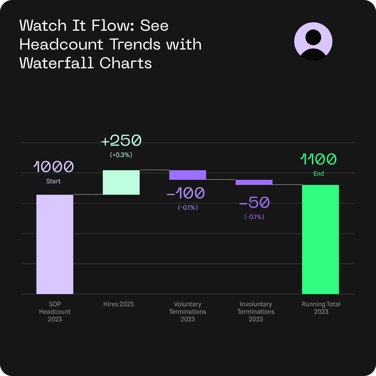
Use Case: Explaining Headcount Changes
Scenario: The CEO asks for a quick update on workforce growth. Instead of handing over a spreadsheet, show a waterfall chart that breaks down the change:
- Starting headcount: 1,000
- +299 new hires
- 114 voluntary terminations
- 155 involuntary terminations
- Ending headcount: 1,030

Now leadership can see more than just the incremental headcount increase. They understand what’s behind the growth—whether hiring is meeting demand, and whether attrition is a concern. The chart shifts the conversation from “What happened?” to “What do we need to act on?”
This type of breakdown is especially valuable during budget reviews, reorganizations, or merger planning, where workforce movement needs to be clearly explained and justified.
But headcount changes aren’t just a company-wide story, they’re built on countless individual shifts happening across departments. Promotions, transfers, and team realignments often play a huge role. A waterfall chart makes those internal flows visible too, helping you show not just growth, but how that growth is being shaped from within.

In the chart above, you can see this department isn’t just growing, it’s optimizing talent placement from the inside through promotions and transfers.
Or take it one step further with a year-over-year waterfall. Seeing workforce changes across multiple years—periods of growth, attrition spikes, hiring drives—helps contextualize trends and spot inflection points.
-2.png?width=1013&height=395&name=Headcount%20Changes%20Last%203%20Years%20(1)-2.png)
In the chart above, it's easy to observe how consistent hiring outpaced both voluntary and involuntary exits, resulting in sustained headcount growth over time.
For One Model customers: You can also use the Waterfall Chart to visualize your Headcount Reconciliation Report. This helps surface discrepancies caused by unrecognized termination reasons, acquisitions, or other data quality issues. Addressing these early ensures your metrics and dimensions stay clean, accurate, and actionable.
One Model’s Waterfall Chart: Designed for HR
Many BI tools offer waterfall charts, but they’re usually tailored for financial analysts. One Model’s new waterfall visualization is designed specifically for HR workflows and people data, with the flexibility and depth HR teams actually need.
This means you can:
- Track key movements – like growth, exits, and internal mobility over time
- Segment by dimension – such as department, location, or employee type
- Drill into the details – click to explore root causes or dig deeper
- Present with clarity – with labeled bars, color-coded trends, and clean visuals
Because it’s native to the One Model platform, the waterfall chart connects to your people data model, which ensures consistent definitions and always-fresh data. It also aligns with the other analytics visuals your team already uses, making it easy to add to dashboards or presentations.
Making Data Talk
Workforce dynamics are complex. People leave, get promoted, transfer, take leave, return, or burn out. Metrics are constantly in motion. Waterfall charts bring order to that movement. They unpack complexity without overwhelming your audience and, when paired with strong data governance, they become one of HR’s most effective storytelling tools.
Explore more on storytelling with data.
