
As a people analytics leader, you’re going to be confronted with some not-so-simple, horribly open-ended questions: “Hey, so what do you want to measure?” Where should we start?” or…
“What HR dashboards should we build?”
Perhaps these words have been uttered by a well-intentioned business analyst from IT, peering at you from behind a laptop, eager to get your items added into an upcoming sprint before all their resources get tied up with something else.
What do you say? Something really gnarly and fancy that shows your analytic savvy? Something that focuses on a key issue confronting the organization? Something basic?
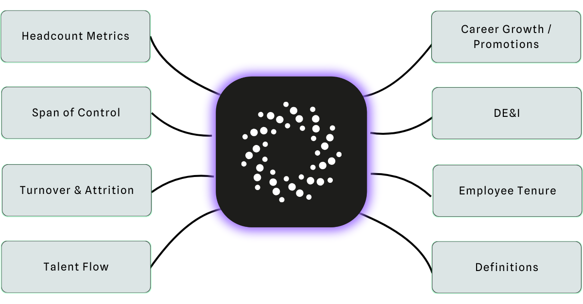
Fear not. In this blog post, we’ll walk you through eight essential people analytics dashboards. You should be able to get the HR data for all of these from your core HRIS or HCM solution, even if they’re in different modules and you have to combine it into one dataset. The key performance indicators (KPIs) in these views will give you the highest impact:
- Headcount Metrics Dashboard
- Span of Control Dashboard
- Employee Turnover Dashboard or Attrition Dashboard
- Talent Flow Dashboard
- Career Growth / Promotions Dashboard
- Diversity (DE&I) Dashboard
- Employee Tenure Dashboard
- …see below…
1: Headcount Metrics Dashboard
Headcount metrics are the foundation of people analytics. Headcount speaks volumes. Trend it over time, break it out by key groupings, and you are well on your way to doing great people analytics. Here’s an initial view that captures the basics.

Here’s what’s included in this dashboard so you can get a handle on headcount.
In the upper right, you’ve got what I call the “walking around the number”. It’s not anything that will help you make an informed decision on anything. But this is the stat that you would feel embarrassed if someone asked you and you didn’t know off the top of your head. Here it’s the total number of employees as of the current point in time. (EOP is shorthand for End of Period. Be precise in how you define things. More on this at the end.)
Next, you’ll want to see the headcount trended over time. Here we have a monthly trend paired with the same period last year. Boom. Now you can see how things are changing and how they compare with the previous year.
Also, these two visuals are a great test run for your existing reporting and analytics capabilities.
In the bottom right, here you have headcount broken out by org unit (or business unit, or supervisory org for you Workday types). Here you want not only the total counts but ideally a stacked column view so you can see the proportion of contractors, part-time, co-op, or other employment types. Different orgs might get their work done in different ways. You should know the differences.
Finally, a map view of headcount by geography. It’s not a basic visual, but it has certainly become essential. Things happen in the world. You need to know where your workforce is so you can quickly estimate the impact and plan support. In just the past two years, employees have been impacted by wildfires, heat domes, political unrest, blizzards, cold snaps, flooding, and, of course, COVID. Geo maps have officially gone from fancy visual to essential view.
2: Span of Control Dashboard
I’m going to change things up a bit by elevating the span of control to the second slot on this list. Don’t worry. We dive into attrition and representation later in the article.
As a people leader, you’ve got to maintain some perspective on how efficiently your workforce gets work done. There are many ways to do this. You could calculate the total cost of your workforce. You could align those costs against revenue over time. By all means, do that.
But this list is also there to help you get started. With just the data from your core HCM / HRIS system, your team should be able to show you the span of control and organizational layers. These metrics always remind me of stepping on a scale. If your span of control is ticking down, you’re getting less lean. If you’re adding more layers, your internal coordination costs are going up. There could be good reasons for this– but there sure as heck can be bad reasons for this.
Here you’ll find your key Span of Control Metrics, your trend over time, and your layers and org units visualized.

The real killer metric – if you’ve got the stomach for it – is a simple list of the number of managers in your organization that have only one or two direct reports.
Use these views to keep your talent management processes grounded in business reality. If your existing team/technology can’t produce these views then shift them back.
3: Employee Turnover Dashboard or Attrition Dashboard
Ok, we can’t go any further without employee turnover. Attrition if you’re feeling fancy. Turnover is the strongest signal you get from your workforce. Someone worked here and– for one reason or another– it didn’t work out. Changing jobs and firing an employee are both major events. Your workforce is telling you something and you need to listen to help you with employee retention.

Here’s a basic view to get you started. Again, get your rolling 12-month termination rate up at the top and trend it out with the previous year for context.
Below that, you see a breakout of voluntary and involuntary termination rates. Then, you can see breakouts by business unit, location, and org tenure groupings. Now with a glance, you can see how turnover rates are changing, where they are high, and whether it’s you or the employee forcing the change. Learn more how to calculate the cost of turnover.
4: Talent Flow Dashboard
Once you’ve got a turnover view squared away, you can move into broader views of talent movement within your organization. Here’s a high-level talent flow view to get started. It leads off with a consolidated view of hires, terms, and net hires trend over time. I love this view because it lends itself to discussions of churn and the cost of turnover.

The top area (green) shows external hires. The bottom (red) shows exits/terminations. The dark bars show the difference: net hires.
The big question. How much of that time and money that you put into recruiting is just to replace the people who leave the company? A great variation on this view is to limit it to women or underrepresented groups. Are you working hard to attract these demographics, only to have them leave because they don’t find the organization to be a fit for them? We’ll get to more workforce representation views below.
Next to the Net Hire Trend, you can mix in a growth metric and a helpful breakout by “business unit, so you can keep an eye on what segments of the organization are growing/shrinking. Are they the ones you expect? Later when you bring in data from other systems like learning, this view can be a place to collaborate with the learning team to answer questions like: Are you adding more employees, when you could be upskilling?
Finally, get a solid crosstab view of promotions or movements. This will help you optimize talent development and answer questions like: Do people move from function to function? If so, what are the common paths? What paths don’t exist? Should they?
5: Career Growth / Promotions Dashboard
After you get the big picture on movements, dig into promotions. In my mind, the movement and span of control views are about what the organization is experiencing. Promotions put you more in the mind of your employees and what career opportunities look like in your organization.

I’ve added two of our key metrics to the top of this one. What’s the rate at which people get promoted and how long is the typical wait for promotion? Once you know the typical (average or median is fine) wait time, keep your ears out for high potential / high performers who have run past that mark. They’re probably keeping a rough estimate of that metric in their minds as well.
Below that are two breakout views. The first one - “Manager Hires vs. Promotions to Manager” - is meant to look at a key milestone in career growth. I’ve used promotion to manager, but you might have unique ones. Then for each business unit, I’ve compared the number of promotions into that key group with the number of outside hires in that group. Are you growing your own leaders (or another key group)? If not, why?
Filling out the bottom row is the “Termination Rate and Headcount by Time since Last Promotion” view. Look for two things here: 1) Do people leave if they don’t get promoted? 2) Do people leave right after they get promoted?
6: Diversity (DE&I) Dashboard
It’s past time we brought in views of the diversity, equity and inclusion (DE&I) in your workforce. Many of the views in the dashboard below are split out versions of the metrics introduced above.

Above is a sample diversity dashboard using male / female breakouts.
Use this as a template for other representation breakouts including ethnicity, gender identity, age, etc. Any of these views could be modified to incorporate multiple, rather than just two, groupings.
The top bar shows activity differentials over time. Hires are done simply as counts. Do you hire more men than women? Are promotions and terminations handed as rates to monitor for disproportionate outcomes?, i.e. are men promoted more often than women?
The second row shows representation by key grouping in stacked horizontal bars. I like organizational layer and salary band to show if high career outcomes are disproportionate. I’d recommend the inclusion of tenure as well, however. If your organization had a history of disproportionate staffing, you will get a clue in this view. That could explain why today’s initiatives have not yet balanced out outcomes in level or pay. Or differences in tenure might be explained by differences in termination rates, depicted directly above in this view. This is a multifaceted issue.
7: Employee Tenure Dashboard
Confession. I love tenure. I’ve come of age in my career amid data telling me that I’ll work for something like 11 companies before I retire. And, to be honest, I’ve done my share of career hopping.
But it turns out that when you stick around somewhere, you learn things. You make connections with your co-workers. Employee tenure represents the accumulation of invaluable knowledge and connections that help you measure the value of your human capital.

Next to average tenure, this dashboard shows the total accumulated workforce tenure in years. While not exactly a “walking around number,” you can use this to impress your fellow leaders into thinking about your workforce like the treasured asset it is. “Hey, our team has x millennia of accumulated experience!”
Rounding out this view is a sorted view of positions or job titles with lots of accumulated experience as well as a stacked trend over time to see how tenure groupings are changing.
8: Dashboard Definitions and Details
This final section is not a specific dashboard suggestion. Rather, it’s intended as a sobering reminder that none of the dashboards above will make an impact in your organization if you can’t explain your logic and build trust in your data.
I like to build little glossary style views right into the dashboards I create. For example, at the bottom of our standard attrition storyboards, I’ve added breakouts showing which termination reason codes are included as voluntary and which are involuntary.

Next to my glossary, I’ve created a table that breaks out the subcomponents of turnover rate, such as total headcount and days in period. I like to include at least one leap year for a bit of showmanship. “Look, I’ve even accounted for the fact that 2020 had 366 days, so back off.”
Finally, if your security models and technology support it, drill to detail. This is the number one, all-time champion feature of people analytics. Click on headcount, terminations, whatever and see the actual people included in the data. Bonus points for adding the definition and “bread crumb trail” for metrics that build off of other metrics.
Below is a view of how we do that in One Model.
If you’d like to see these people analytics dashboards in action or learn more about people analytics software for your organization,
reach out to us!
