

Last week I was doodling some recruiting graphs in my notebook, with an eye toward building out some new recruiting efficiency dashboards. I was thinking about how requisitions age over time and I got an idea for a cool stacked graph that counts up how many requisitions you have open each month and breaks them out into age buckets. Maybe some supporting breakouts like recruiter, some summary metrics, etc. Something like this:
 Phil's Beautifully Hand-illustrated Cholesterol Graph (above)
This would be an awesome view. At a glance I could see whether my total req load was growing and I could see if I’m starting to get a build up of really old reqs clogging the system.
This last part is why I was thinking of calling it the Requisition Cholesterol Graph. (That said, my teammate Josh says he hates that name. There is a comment option below… back me up here!)
But then I got to thinking, how am I actually going to build that? What would the data look like? Think about it:
Given: I have my list of requisitions and I know the open date and close date for each of them.
Problem #1: I want to calculate the number of open reqs I have at the end of each time period. Time periods might be years, quarters, months, or days. So I need some logic to figure out if the req is open during each of those time periods.
If you’re an Excel ninja then you might start thinking about making a ton of columns and using some conditional formulas. Or… maybe you figure you can create some sort of pancake stacks of rows by dragging a clever formula down the sheet… Also if you are an Excel ninja… High Five! Being an Excel ninja is cool!
But this would be pretty insane to do in Excel. And it would be really manual. You’d probably wind up with a static report based on quarters or something and the first person you show it to will ask if they can group it by months instead. #%^#!!!
If you’re a full on Business Intelligence hotshot or python / R wiz, then you might work out some tricky joins to inflate the data set to include a record or a script count a value for each time the reqs open date is before or within a given period, etc. Do able. But then…
Problem #2: Now you have your overall count of reqs open in each period. Alls you have to do now is group the requisitions by age and you’re… oh… shoot. The age grouping of the requisitions changes as time goes on!
For example, let’s say you created a requisition on January 1, 2017. It’s still open. You should count the requisition in your open req count for January 2017 and you’d also count it in your open req count for June 2018 (because it’s still open). Figuring all that out was problem #1.
But now you want to group your requisitions by age ranges. So back in January 2017, the req would count in your 0 - 3 months old grouping. Now it’s in your > 1 year grouping. The grouping changes dynamically over time. Ugh. This is another layer of logic to control for. Now you’re going to have a very wild Excel sheet or even more clever scripting logic.
Or you’re just going to give up on the whole vision, calculate the average days open across all your reqs, and call it a day.
$Time_Context is on my side (Gets a little technical)
But I didn’t have to give up. It turns out that all this dynamic grouping stuff just gets handled in the One Model data structure and query logic -- thanks to a wonderful little parameter called $Time_Context (and no doubt a lot of elegant supporting programming by the engineering team).
When I ran into $Time_Context while studying how we do Org Tenure I got pretty excited and ran over to Josh and yelled, “Is this what I think it is!?” (via Slack). He confirmed for me that yes, it was what I hoped it was.
I already knew that the data model could handle Problem #1 using some conditional logic around effective and end dates. When you run a query across multiple time periods in One Model, the system can consider a date range and automatically tally up accurate end of period (or start of period) counts bases on those date ranges. If you have a requisition that was opened in January 2017 and you want to calculate the number of reqs you have open at the end of every month, One Model will cycle through the end of each month, check to see if the req was opened before then and is not yet closed, and add it to the totals. We use this for all sorts of stuff, particularly headcount calculations using effective dates and end dates.
So problem one was no problem, but I expected this. What I didn’t expect and what made me Slack for joy was how easily I could also deal with Problem #2. Turns out I could build a data model and stick $Time_Context in the join to my age dimension. Then One Model would just handle the rest for me.
If you’ve gotten involved in the database side of analytics before, then you’re probably acquainted with terms like fact and dimension tables. If you haven’t, just think vlookups in Excel.
So, rather than doing a typical join or vlookup, One Model allows you to insert a time context parameter into the join. This basically means, “Hey One Model, when you calculate which age bucket to put this req in, imagine yourself back in time in whatever time context you are adding up at that moment. If you’re doing the math for January 2017, then figure out how old the req was back then, not how old is is now. When you get to February 2017, do the same thing.”
And thus, Problem #2 becomes no problem. As the query goes along counting up your metric by time period, it looks up the relevant requisition age grouping and pulls in the correct value as of that particular moment in time. So, with our example above, it goes along and says, “Ok I’m imagining that it’s January 2017. I’ll count this requisition as being open in this period of time and I’ll group it under the 0 - 3 month old range.” Later it gets to June 2018 and it says, “Ok… dang that req is STILL open. I’ll include it in the counts for this month again and let’s see… ok it’s now over a year old.”
This, my friends, is what computers are for! We use this trick all the time, particularly for organization and position tenure calculations.
TL;DR
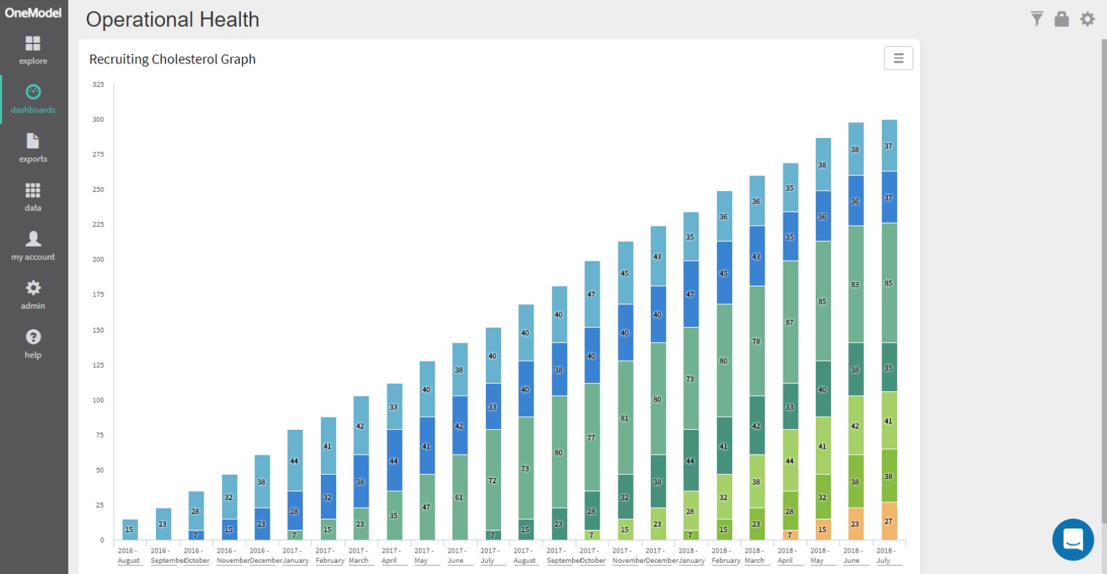
In short, One Model can make the graph that I was dreaming of-- no problem. It just handles all the time complexity for me. Here’s the result in all it’s majestic, stacked column glory:

So now at a glance I can tell if my overall requisition load is increasing. And I can see down at the bottom that I’m starting to develop some gunky buildup of old requisitions (orange). If I wanted to, I could also adjust the colors to make the bottom tiers look an ugly gunky brown like in the posters in your doctors office. Hmmm… maybe Josh has a point about the name...
And because One Model can handle queries like this on the fly, I can explore these results in more detail without having to rework the data. I can filter or break the data out to see which recruiters or departments have the worst recruiting cholesterol. I can drill in and see which particular reqs are stuck in the system.
And, if you hung on for this whole read, then you are awesome too. Kick back and enjoy some Rolling Stones: https://www.youtube.com/watch?v=wbMWdIjArg0.
