

Now that many of our customers have complete control and access to their data like never before, they're exploring how to tell better data stories. A fun way to explore this topic is to look at the great examples from the past.
Minyard’s example shows us how to tell a story with data
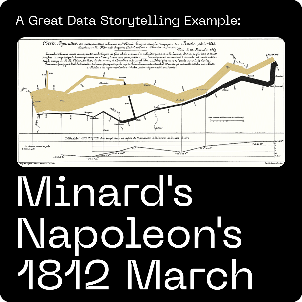
Let’s take this example forward to one of history's most famous data stories, Minard’s visualization of Napoleon’s 1812 march into Russia. Edward Tufte, a renowned expert in data visualization, praised Minard's visualization of Napoleon's 1812 march. In his book "The Visual Display of Quantitative Information," Tufte referred to Minard's graphic as "probably the best statistical graphic ever drawn”.

Although not directly HR (other than in a dark way, a visualization of workforce attrition over time), we can still analyze how this visual fits into the framework of six effective data storytelling elements and apply those lessons to HR storytelling:
- Business Objective: In the context of HR, the objective was to convey a message and inspire action. Minard's visualization powerfully demonstrates the disastrous consequences of Napoleon's march, highlighting the importance of understanding the impact of decisions on people.
- Evidence: Minard's visualization uses data from multiple sources, such as the number of soldiers, their geographic locations, and temperature. In HR data storytelling, this would translate to gathering relevant data from various sources like employee engagement surveys, performance metrics, or attrition rates, to support the narrative.
- Visuals: Minard's visualization is a clear, engaging visual representation of complex data. Similarly, HR professionals should utilize data visualization tools to create visually appealing and easy-to-understand representations of workforce data.

- Narratives: Minard's map tells the data-informed story of the march's progression and the resulting loss of soldiers. In HR data storytelling, a compelling narrative should weave together the data and insights, making them relatable and memorable for the audience.
- Interactivity: While Minard's visualization is static, you could imagine leaders in the armed forces looking for cuts of this data by troop category, demographics, and nationality (pre-GDPR). Interactivity would have allowed Minard to engage quickly with the graphic to see different cuts of the data. HR professionals adapt their data stories based on the audience's questions and feedback, making the story more engaging and dynamic.
- Action: Minard's visualization serves as a cautionary tale, prompting leaders to consider the consequences of their decisions. In HR data storytelling, ending the story with a clear call to action can drive engagement and ensure the story leads to meaningful change within the organization.

By analyzing Minard's data storytelling example in the context of the simple six-element storytelling framework, HR professionals can gain valuable insights on how to create data-informed stories that effectively communicate the human impact of organizational decisions and inspire meaningful change.
Check out 8 Essential People Analytics Dashboards

